There’s Something About the Intro to Orange Is the New Black
Dilettantes!
Welcome to my new DA series all about random stuff that I notice and then perseverate on!
Did you read the title? You probably did. If you read the title, then you already have a pretty good idea of how this is going to work. Every piece in this series begins with the amorphous observation, “there’s something about ______.” Then it’s my job to figure out what in God’s name I’m trying to say.
This is a lot like my regular life, except that I am typing instead of talking/shouting. You’re welcome, SARA.
Hey, remember when we were talking about the title just now? So, the second half of today’s heading is “the intro to Orange Is the New Black.” What IS IT about that title sequence anyway? I’m not sure, but it’s something, by golly.
Been awhile since you’ve seen it? Feel free to refresh your memory…
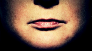
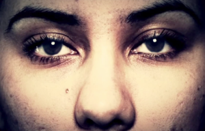
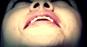
This opening sequence, designed by Thomas Cobb Group, features images of previously incarcerated women; these portraits are close-cropped to focus on either the subject’s eyes/nose, or mouth.[1] The women’s faces flash by in quick succession; the intro is punctuated by occasional images of common indicators of incarceration: the fingerprinting process, a prison fence, an orange uniform. “You’ve Got Time,” a song written by Regina Spektor specifically for the series, plays throughout.[2]
The OITNB intro does not feature any of the actresses or actors on the show; the women on display in the opening sequence are all former inmates. Many of the women photographed are involved with the “gang intervention, rehabilitation and re-entry program” Homebody Industries.[3][4]
From what I can tell—and I’ve done multiple Google searches on this, y’all, so I feel pretty confident—the OITNB opening is one of those things that you either love or you hate.
Emily Zemler in her article for Maxim declares, “Jenji Kohan created an interesting, evocative series, but the credits just don’t do it justice.”[5] A 2014 HuffPo article goes so far as to refer to it as “the most annoying opening credits sequences ever.” [6]
Side note: please spare yourself the emotional damage of reading message boards about this topic. The level of vitriol expressed will morph you into a sad clown.
There are, alternatively, a great many people who enjoy and praise the title sequence. Numerous fans of the OITNB opening reference the authenticity of the final product, since the opening features non-famous women, rather than actresses.
Carrey Dunne of Fast Company’s Co.Design calls this “no-filter approach” “radical,” in that it “celebrates real women.” [7][8] No disagreements here.
However, as I ruminated—and ignored my laundry for the fourth day in a row[9]—I realized that my appreciation of this short text is about more than just putting formerly incarcerated women in front of the camera.
The formal qualities of the photographs are thematically relevant and evocative.
BECAUSE OF REPRESSIVE PHOTOGRAPHY, PEOPLE.
So, now we’re going to jump into some history of photography. When we come out on the other side, we’ll take another look at our object of analysis. If you’re drinking along at home, take a swig every time that you read the word “repressive.” (But don’t, because you will die.)
What do I mean by “repressive photography?”
Roger Hargreaves argues in his book The Beautiful and Damned that since the invention of photography in 1839, the history of photographic portraiture “has been defined by two dominant narratives, those of art and science.”[10] The art historical tradition of bourgeois “self-representation” is referred to, by photographer and theorist Allan Sekula, as honorific portraiture (that’s a topic for another day); the institutional, scientific tradition of representing “prisoners, patients, and the poor” is termed repressive portraiture.[11]
In the mid-nineteenth century, as photographic technologies improved and became more accessible, the expanding middle classes in the United States and Europe utilized photographic portraits as social currency to communicate status, prestige, and wealth (honorific all the way).[12] Simultaneously, photographic technologies were adopted by powerful knowledge-making institutions to replace scientific sketches and paintings (many of these uses fall under the category of repressive photography).
Repressive portrait photography is characterized by even, uniform lighting. The subject sits against a plain background, and s/he is positioned facing the camera—head-on photographs are sometimes situated alongside profile pictures.[13] These photographs lack depth; the subject is situated in a narrow and confined visual field.[14] Sets or collections of repressive photographs use consistent backgrounds, lighting, positioning, and framing.[15]
How and why did repressive photography develop?
Because one could use a camera[16], rather than a human hand, to produce an image, and because a photo was, theoretically, reproducible, the photograph became the ideal visual record for a number of scientific institutions.[17] Scientifically-minded photographic practices, aimed at “objectivity,” developed in anthropology, law, medicine, and, of course, criminology.
By the 1880s various scientific fields, including those of criminology, anthropology, and eugenics, began to develop specific industry-wide standards for scientific photography. Peter Hamilton explains that pre-scientific conceptions of physiognomy and phrenology were reimagined and updated when “scientific” photographic technologies became available.[18]
Francis Galton, for example, considered by many to be the father of eugenics, employed photography in the last decades of the nineteenth century in an attempt to better understand physiognomic types. His goal was to ascertain those facial traits that lead to moral corruption and aberrant behavior.[19] Cesare Lombroso, the chair of legal medicine and public hygiene at Turin University, conducted a phrenological and physiognomic study on the heads of notorious Italian criminals.[20] He also prepared photographs of specific criminals in order to display those individuals who most completely exemplified the criminal type.[21]
Galton, Lombroso, and their peers developed photographic standards in order to enable easy comparisons between subjects. Consequently, by the end of the nineteenth century, an emphasis on frontality, with the sitter photographed “head-on,” became the standard for scientific portraiture.
Alphonse Bertillon gets the credit for standardizing police photography in order to facilitate comparisons between photographic subjects and increase the photograph’s usability as a recognition tool.[22] Bertillon called for scientific photography that was aesthetically and artistically neutral. His goal was to expedite the comparison process by positioning the subjects similarly and using uniform frames and backgrounds.[23]
Police departments in the United States started to use Bertillon’s method of cataloguing criminals in the 1890s.[24] The United States’ Immigration Bureau began using the Bertillon system in 1903.[25] Eventually these institutions refined Bertillon’s system to better suit their specific needs, but the core principles of ostensibly objective, easily recognizable, naturalistic portraits remained. As Peter Hamilton explains in The Beautiful and the Damned…
Indeed it is probably due to Bertillon that the full-face ‘identity’ photograph has become so widespread throughout the world as the standard method for identifying individuals…what began in the mid-nineteenth century as a method of anthropological classification had become the dominant metaphor of photographically supported identity by the twenty-first century.[26].
When you read critical theory about repressive photography (and please do! It’s some wild and wacky stuff), you get a better sense of how this category has been expanded, troubled, and reframed (whatup Punsville, USA).
For example, so far we have been talking about recognizing the form of repressive photography, as displayed in the photograph itself. But, it’s important to realize that the category “repressive photography” can also take into account the conditions of creation (e.g. being forced to stand still for a mugshot), as well as the use of the photograph (e.g. filing the photograph in a police archive).
These factors are all interconnected; as visual consumers, we see a repressively-styled photo and we can imagine the conditions under which the picture was taken; we can imagine the intended use of the image. Likewise, when we use an online database to research a person’s criminal record, we have an expectation of the type of portrait that will be included in the file: a close-cropped, front-facing, minimally embellished repressive portrait.
The visual legacy of repressive photographic practices is ubiquitous and normalized; “Even in the most banal of photographic portraits created for our driving licenses and passports,” argues Peter Hamilton “we can discern a trace of those influences.”[27]
Let’s Get Critical: Orange Is The New Black
As Anna Pegler-Gordon makes clear, markers of “repressive photography… [are] visible in the form of the photograph.”[28] The OITNB opening appropriates and mimics the standard conventions of repressive photography to great visual effect.
The images in this title sequence emphasize frontality—every woman faces the camera straight on. The background against which the women sit is nondescript and uniform. The lighting is stark and unfiltered; one gets the impression that the sitter is being illuminated by a pointed spotlight.
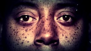
And what of the focus on the subject’s eyes/nose OR mouth?
Consider John Tagg’s insight into the repressive portrait (emphasis mine):
It is a portrait of the product of the disciplinary method: the body made object; divided and studied; enclosed in a cellular structure of space whose architecture is the file-index; made docile and forced to yield up its truth; separated and individuated; subjected and made subject.[29]
OITNB’s images illustrate a further parsing of the body; an itemization of the subject’s unique physical characteristics.
And, importantly, these images do not appear in isolation. Rather, they flash across our screens in quick succession. The framing and scale of the images remain consistent: one, after another, after another.
As we’ve learned, a primary goal in the development of repressive photography was to enable efficient and effective comparisons between images. The consistent framing of the OITNB opening pushes the viewer to automatically, perhaps subconsciously, compare the images before her.
The respective compositions of these images are so uniform that one could, theoretically, take a page out of Galton’s book and produce composite images from the intro. But, maybe don’t do that, because Galton’s book is probably pretty pro…you know…eugenics.
The OITNB opening doesn’t just showcase conventions of repressive photography; it puts them to work in order to communicate a larger point about our criminal justice system.
Let’s quickly consider the role of the opening sequence. Theorist Georg Stanitzek, discussing the purpose of the title sequence in film, claims, “The title sequence has to lead into what follows… capture the genre, and the specific ‘mood’ of what is to come, so that one is initiated into the cinematic narrative, the diegesis.”[30] I contend that the television title sequence is similarly tasked.
Plus, the T.V. title sequence—specifically in the case of Orange is the New Black—remains consistent from episode to episode. No matter what is happening in the plot of the show, the opening of the show is the same. For one minute and eleven seconds, every episode, we are taken out of the collective narrative of Suzanne, Red, Taystee, Gloria, and Pennsatucky (oops, am I playing favorites?), and reminded of the broader, real-life social and political context in which this fictional narrative is situated.
The only other images shown in the opening are those of institutional, authoritarian tools:
- The prison fence and barbed wire remind us that prisoners cannot roam.
- An image of hands in handcuffs shows us ways in which bodies are immobilized.
- The recording of fingerprints parses the body into identifiable, indexable component parts for an archive.
- An orange prison-issued jumpsuit enforces uniformity within the prison setting.
- A prison phone bank emphasizes the ways in which incarcerated people are socially and physically isolated from friends and loved ones.
- A guard tower makes visible the high level of, seemingly omnipresent, monitoring to which prisoners are subjected.
And repressive photographic conventions throughout the title sequence remind us that, from the moment a person is subjected to a booking photo, she is surveilled and catalogued by the state.
The OITNB opening puts repressive photography to work in the sense that it plays with the constraints of institutional photography in order to make visible the regimented, dehumanizing structure in which incarcerated folks are trapped.
Within the opening there are rare, humanizing seconds in which the subject moves within the frame: a blink, a slight shift of the head, a smile. A woman laughs, and her head flies back. The visual frame is stagnant and rigid; we, as the viewer, cannot follow her movements. The slightest shifts in the women’s positions make the repressive frame all the more visible and pronounced.
The portrait images used in the Orange is the New Black opening do more than just bring non-actresses to the fore. The formal conventions of these images speak to the inflexible and systematized tools of discipline to which these women are/were subjected.
One final consideration:
It is unclear whether the makers of these images, Michael Trim and Thomas Cobb, made a conscious decision to style these images as repressive portraits (or repressive portraits to the nth degree, given that they are extreme close-ups).
The executive producer at Thomas Cobb Group Studio, Gary Bryman, had this to say when interviewed by Co.Design writer Carrey Dunne:
Thomas found this really interesting sweet spot of cropped compositions that would not necessarily reveal who the person was, but at the same time provide a portal into their soul through their eyes.[31][32]
His comment makes no mention of the stylistic similarities Cobb and Trim’s images share with repressive photography. In fact, I have yet to find any references from anyone affiliated with the project that discuss a conscious decision to mimic repressive photography, mugshots, or booking photos.
The thing about repressive photography—what it looks like, how it’s used, how it makes us feel—is that it is so deeply entrenched in our culture, so ubiquitous, that we often don’t give it a lot of thought. It is entirely possible that when Cobb and Trim set out to photograph and film former inmates, they stuck to these stylistic conventions because it seemed like the natural choice—it seemed common sense.
Ultimately, regardless of whether or not it was a conscious decision, the type of photography employed in the Orange is the New Black title sequence allows the viewer to get a fuller sense of the crux of the show—that, as show-runner Jenji Kohan contends, prison is “just a horrible place to be”[33] and that “there’s more to these people than what they’re displaying in this extreme situation.”[34]
[1] Carey Dunne, “Move Over, Dove. “Orange Is The New Black” Celebrates Real Women,” Fast Co. Design Blog, August 20, 2013, http://www.fastcodesign.com/1673132/move-over-dove-orange-is-the-new-black-celebrates-real-women.
[2] According to several articles, including Dunne’s article cited above, TCG’s first idea for the OITNB opener was largely about Piper (played by Taylor Schilling.) It was Jenji Kohan who proposed an opening that honored the ensemble feel of the show. The final product is TCG’s response to that request.
[3] Learn more about Homeboy Industries here http://www.homeboyindustries.org
[4] Dunne, “Move Over, Dove. “Orange Is The New Black” Celebrates Real Women.”
[5] Emily Zemler, “5 Best and 5 Worst TV Opening Credits,” Maxim, accessed August 3, 2016, http://www.maxim.com/entertainment/5-best-and-5-worst-tv-opening-credits.
[6] “9 TV Show Intros That Are Too Good To Skip,” Huffington Post, last updated August 8, 2014, http://www.huffingtonpost.com/2014/08/08/best-tv-intros_n_5659243.html.
[7] Dunne, “Move Over, Dove. “Orange Is The New Black” Celebrates Real Women.”
[8] It’s ok to agree with this larger point, while continuing to dislike the term “real women.” I do.
[9] Pro tip: you don’t really NEED clean clothes if you never leave your house.
[10] Roger Hargreaves, “Putting Faces to the Names: Social and Celebrity Portrait Photography,” in The Beautiful and the Damned, ed. Peter Hamilton and Roger Hargreaves (Burlington, VT: Lund Humphries, 2001), 17.
[11] Allan Sekula, “The Body and the Archive,” October 39, ed. Richard Bolton, (Cambridge: MIT Press, 1989), 44.
[12] Peter Hamilton, “Policing the Face,” in The Beautiful and the Damned, ed. Peter Hamilton and Roger Hargreaves, (Burlington, VT: Lund Humphries, 2001), 57.
[13] David Green, “Veins of Resemblance: Photography and Eugenics,” Oxford Art Journal 7 (1984): 8.
[14] Green, “Veins of Resemblance: Photography and Eugenics,” 8.
[15] John Tagg, The Burden of Representation: Essays on Photographies and Histories, (Minneapolis: University of Minnesota Press, 1988), 85.
[16] The camera is a machine, so it must produce an objective record, you guys! REAL CUTE.
[17] Anne-Marie Willis, “Digitisation and the Living Death of Photography,” in Culture Technology and Creativity in the Late Twentieth Century, ed. Philip Hayward, (London: John Libbey & Company, Ltd, 1990), 201.
[18] Hamilton, “Policing the Face,” 61.
[19] Sekula, “The Body and the Archive,” 44.
[20] Hamilton, “Policing the Face,” 100.
[21] Hamilton, “Policing the Face,” 101.
[22] Sekula, “The Body and the Archive,” 18.
[23] Hamilton, “Policing the Face,” 105.
[24] Anna Pegler-Gordon, In Sight of America: Photography and the Development of U.S. Immigration Policy (Los Angeles: University of California Press), 80.
[25] Pegler-Gordon, In Sight of America, 83.
[26] Hamilton, “Policing the Face,” 106.
[27] Hamilton, “Policing the Face,” 107.
[28] Pegler-Gordon, In Sight of America, 11.
[29] Tagg, The Burden of Representation, 76.
[30] Georg Stanitzek, “Reading the Title Sequence (Vorspann, Générique),” Cinema Journal 48 (2009), 47.
[31] Dunne, “Move Over, Dove. ‘Orange Is The New Black’ Celebrates Real Women.”
[32] Am I the only one who isn’t buying the “would not necessarily reveal who the person was” bit?
[33] Monica Tan, “Orange is the New Black’s Jenji Kohan: ‘Women tend to be forgotten when they get locked up,’” The Guardian, accessed August 2, 2016, https://www.theguardian.com/tv-and-radio/2016/may/27/orange-is-the-new-blacks-jenji-kohan-women-tend-to-be-forgotten-when-they-get-locked-up Orange
[34] “‘Orange’ Creator Jenji Kohan: ‘Piper Was My Trojan Horse,'” Fresh Air, accessed August 5, 2016, http://www.npr.org/2013/08/13/211639989/orange-creator-jenji-kohan-piper-was-my-trojan-horse.
Dilettante Mail
Get updates from us a few times a year.