Designing History at the Smithsonian
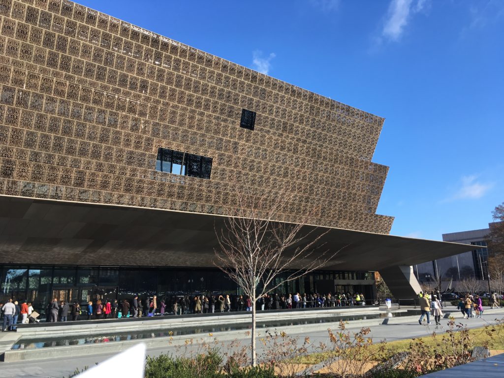
The National Museum of African American History and Culture (NMAAHC) opened its doors for business on September 24, 2016. The NMAAHC sits just west of the Smithsonian National Museum of American History (NMAH), which was built in 1964. Compared to the new museum, the NMAH’s angular, marble facade is looking a bit tired and dated. The NMAAHC, however, glows in the sunlight. It sits on prime real estate—furthest west in the line of Smithsonian institutions, nestled in between American History and the monuments portion of the Mall, and nearly within eyeshot of the White House and the Washington Monument.
The buzz around this new Smithsonian institution is loud and warranted. Due to this, visitors must get tickets online. They are released slowly and in batches, but they are free. If you’re lucky, there are tickets available the morning of but lines are long and there is no guarantee. I was lucky enough to ask the right folks outside the museum which line was which, and they generously gifted me their free, much coveted, extra ticket. Stepping into line, I felt excited to spend the rest of the day wandering around this incredible space.
Like everyone waiting to enter with 10:45am tickets, I participate in a country and culture built on a history of enslavement and torture, but I have never been in a space where I am only taught about that history. I am white and have never been in an institution that did not cater toward my whiteness. With my whiteness comes access to education and a particular comfort in cultural spaces that show the experiences of whiteness as if there is nothing else to consider. My experience at NMAAHC challenged this in a new and needed way, one that I consider constantly as I make my way through other museums and institutions. I was and still am moved by my experience at the NMAAHC and I am perhaps, in this contemporary political moment, looking at my time in this space as a reminder that we find joy in the darkest of times and that change is long and hard but things do, in fact, change.
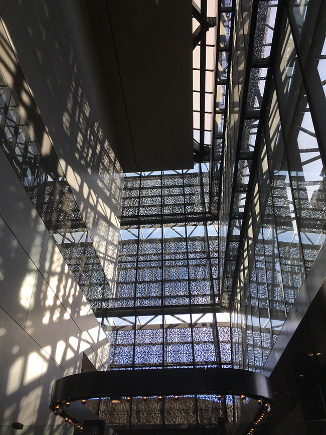
In many ways, the NMAAHC’s architecture guides the visitor at every step, starting with the impressive and beautifully crafted exterior, which speaks to a history of black design culture across the world, through the open space as you walk through the sun-drenched lobby. Heading west within the building, you may opt to take the long escalators down to the history galleries, buried below ground. You could also opt to take the long escalators up to the second, third, and fourth floors, which include galleries that address culture, art, music, and sports, plus the community galleries. There are no printed maps, no one tells you where to go. I chose to head down into history first: while the above-ground structure is impressive, sixty percent of the museum is actually underground.
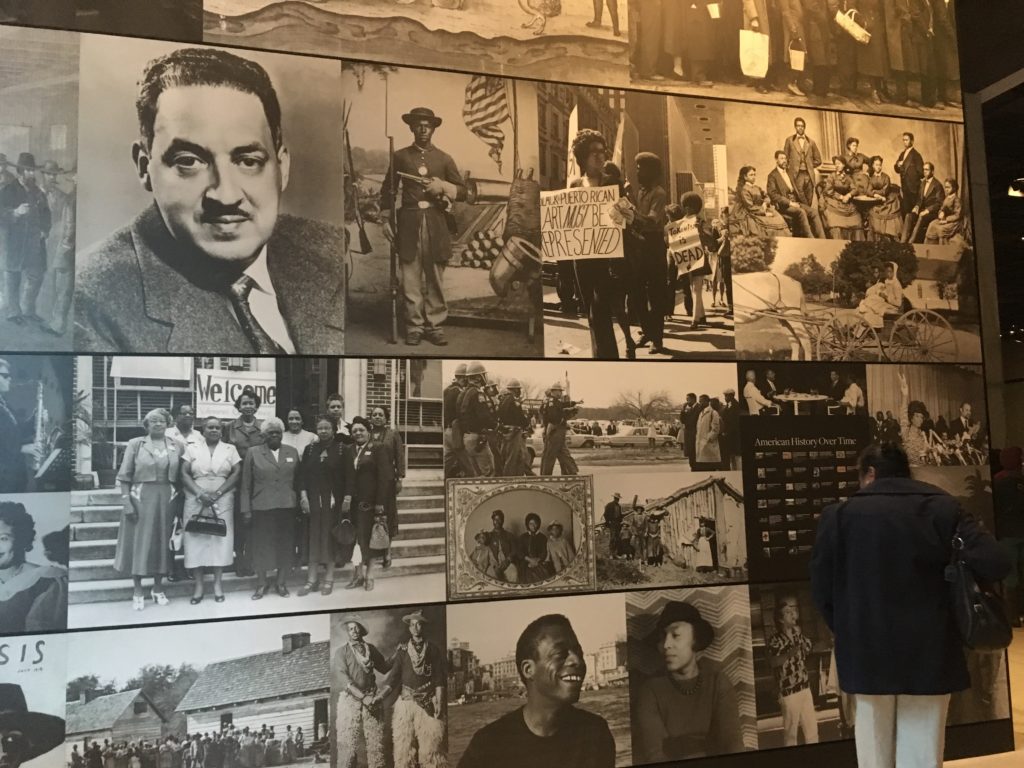
When I arrived, there was a 45-minute wait to get into the David M. Rubenstein History Galleries. In the holding area inside of the gallery, the lights are dim and large photos of Black Americans stared back at us: Rosa Parks looks out from her 1955 mugshot, Olympic medal-winning sprinters Tommie Smith and John Carlos raise black gloved fists in solidarity with the Civil Rights Movement, vernacular images of black families gather over meals. The elevator beyond was crowded, but through its glass windows we could see the 15th through the 21st centuries pass outside of us. There is a timeline outside of the elevator that marked our journey through history, highlighting notable dates in Black history.
We stepped off into a small gathering area before the most historically intensive part of the exhibit started. I immediately noticed that the ceilings seem low, despite my petite stature, and that the lighting is very dim. It was dark and I was surrounded by strangers. I started to feel a little anxious. People didn’t know where to go. I stood still as I tried to get my bearings. A docent got our attention and let us know that we are in the first history gallery, aptly titled “Slavery and Freedom,” which takes us from 1400-1877.
“You’ll notice that the ceilings are short, the walking pathways are narrow, and it’s dark in here. This space is meant to reference what it would be like on a slave ship. There are cramped quarters and it was hard to do what you needed to.” I was surprised to hear this because it was very direct but also because the impact of the designed space really did shape how I moved through the space and made sense of my experience. Confronting my own discomfort as one human corralled in a small, dark, and hot space with other strangers as we maneuvered this painful history together was a new experience.
Museums are institutions that act as educational spaces, and it is crucial to consider the ways in which their architecture and design shape how we interpret the information that we engage with. There is no component of these spaces that goes without consideration of how we will digest information. Media theorist Elizabeth Ellsworth discusses the aims of such architecture in her book Places of Learning: Media, Architecture, Pedagogy:
Architecture becomes pedagogical and pedagogy becomes architectural when their place of joining creates a membrane where the brain/mind/body and the “outside world” touch and interpenetrate, flow into and interfuse each other.[1]
The “Slavery and Freedom” gallery is a precise space in which the spatial construct of the museum coalesces with the information to be absorbed by the patron: it is the fluid space that brings the outside world, both historical and contemporary, into a readily tangible space, to be interpreted and re-imagined.
This intentional design did not encourage comfort; it required some form of interaction between patrons. As I slowly and awkwardly moved forward, sweating and somewhat anxious about how much space I took up with my winter jacket and messenger bag (there were lockers but I didn’t think I needed one), I continually touched other people, trying to read the same placards as I brushed past the mess of others’ arms and torsos. As isolating as the experience was as one singular person in a sea of strangers, I couldn’t help but feel some sense of connection as I trudged forward. I apologized every time I inevitably made contact with another person. When considering the focus of the museum as a space making sense of a difficult shared history, it seems obvious that design would be used not only to foster education but also to force proximity amongst strangers.
It was this proximity that cultivated a peculiar sense of kinship between myself and other folks I had been bumping into around corners in this gallery space. Seeing them later on, we would offer small smiles as we moved through the other spaces together. When we saw each other at the Emmett Till exhibit, a space displaying his original casket and video documentation of an interview with the fallen boy’s mother, it’s possible to say I felt a bit more at ease sharing tissues and quietly crying in the space surrounded by not-quite strangers.
Through my time in the “Slavery and Freedom” gallery, I was forced to consider the ways in which design greatly impacted the curatorial and educational components of the museum experience. By the end of this first gallery space, I was tired and overheated. I walked towards the brighter light coming from the next space, which opened up above me into the end of the 19th century and its noticeably taller ceilings. There was more space to move about, and the muffled tones of the previous space broke open into casual talking and conversation. But there are few benches to sit and reflect, and the bathrooms are two floors away. I once again reckoned with the design of this space and the ways in which we must push ourselves forward to find moments where we can reflect in some comfort while still be confronted with the weight of history that surrounds us.
Heading out of the NMAAHC after four hours, I walked over to the Smithsonian National Museum of American History (NMAH), which I had walked by earlier and thought was an office building. The difference between the institutions was marked. While people still strolled into NMAAHC throughout the afternoon, it was a ghost town next door. There were no lines, and few other patrons wandering into the space. I picked up a paper map to get my bearings and noticed that many exhibits, nearly half of them, were under construction or being revamped. Had their flashier neighbor shown them up, or was it just an ill-timed coincidence?
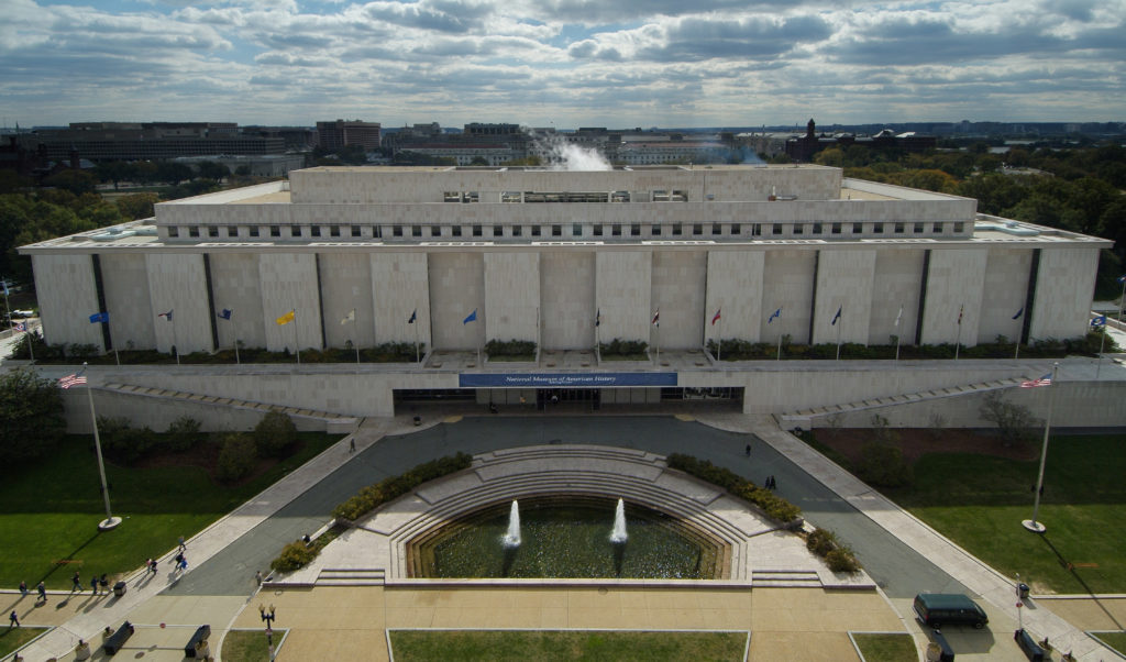
Façade of National American History Museum (image via Smithsonian)
I walked through the space with its tall ceilings and long, wide corridors with plenty of benches and the opportunity to step off into specialized gift shops and exhibit spaces. In this way, the NMAH felt more like a mall, with long mundane spaces serving as passageways in between separated exhibits with little in between. The lighting was outdated and sparse, lending an odd glow to the interior. In similar mall fashion, a few tired people spread out on benches and drank coffee. At NMAAHC, even in the communal areas and corridors, the seating was placed next to something to read or look at. The empty walls of the interior passageways of the NMAH felt weirdly disappointing, as if the curator team simply forgot that this space could be activated.
I felt challenged and invigorated by the NMAAHC and let down and bored at the NMAH. The anxiety I had felt earlier while traversing a space that constricted space and energy forced me to move forward and explore my discomfort as a part of my experience. As I carefully read placards, I learned things I had never considered in my understanding of Black culture and history in America. I also encountered information that I knew, but contextually, my experience was shaped by those around me and the bits of conversation I overheard as other people talked through what they were seeing. If I saw a line build up around something, I knew to head over there and wait to see what other folks were reading.
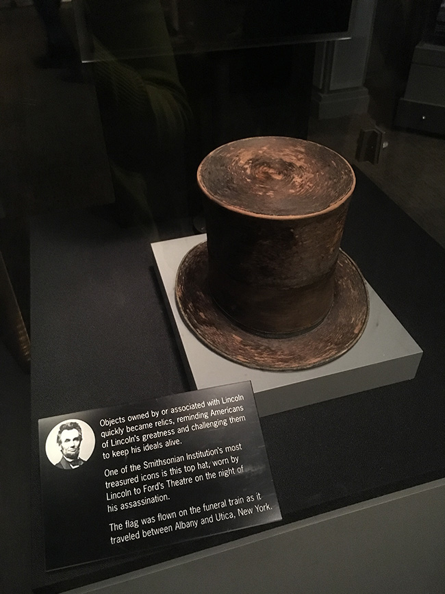
At the NMAH, there was no one to watch or to share my joy and anxiety. While attendance was wildly different for obvious reasons, the design of the NMAH also functions to quarantine the visitor in small nooks and pathways. As I walked up to look at Abraham Lincoln’s original hat, I looked around to see who else wandered the corridors of presidential history, sharing in my small joy of looking at historical objects. Perhaps other potential patrons sulked at home, too upset to consider what this hall might look like in four years, perhaps they were around one of the many corners surrounding me. For all I could tell, it was just me in that space, feeling weirdly isolated.
What separates the NMAAHC from the NMAH is a matter of pedagogical timing. In the 52 years between their opening dates, museum design has evolved. The design mechanisms that make a contemporary space feel so immersive and modern are highlighted aggressively in the NMAAHC: common objects with untold stories, modern fixtures, and spatial details. The NMAH remains mostly untouched and lacks the updated sense of patron interaction and participation. Lastly, its outdated galleries offered very brief explanations of the objects on hand, and failed place items within a larger story of social history. For instance, while the original Bert and Ernie from PBS’ “Sesame Street” were endearing, there was little to read about the context of their development and the impact they made in their long TV lives. The interpretation falls flat and fails to describe the complex story of the actual objects. These singular expressions make the objects feel dated even when they are new acquisitions. The NMAAHC, however, eloquently ties in the larger context for the object’s role in a too seldom-told history.
While the goals of the NMAAHC and the NMAH are different, they face the same challenge when presenting a complicated history through objects and interpretation. As Elizabeth Ellsworth notes in the above quote, the moments of fluidity that happen in the museum space highlight the nuanced and intersectional relationship between the “outside world” and our own experiences. The eloquent intensity of the NMAAHC challenges our whitewashed understanding of American history head-on and without fear. As I walked out the NMAH after an hour and half of bizarre disappointment, I noticed the numerous closed galleries and hoped that those spaces would be inspired by their new glowing neighbor to the west.
- Elizabeth Ellsworth, Places of Learning: Media, Architecture, Pedagogy. (New York: Routledge, 2005), 48.



Dilettante Mail
Get updates from us a few times a year.