Cut and Paste: Teen Magazines and the Collaged Self
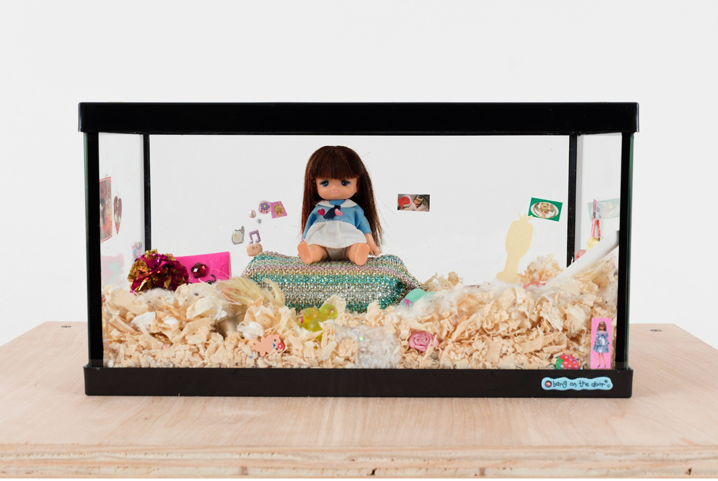
Maggie Lee, installation view of Fufu’s Dreamhouse, at Real Fine Arts, 2016
The bedrooms of Andie Walsh, Kat Stratford, Lux Lisbon, and Lara Jean Covey all share one defining characteristic: a wall covered in handmade collage. Each of these fictional characters live with their desires laid bare inside their living spaces. Audiences watch as these girls lounge on their bed in front of band posters, personal drawings, and ripped out pages from their favorite magazines, as they struggle through their personal process of coming of age. Each character phases through a range of heavy emotions against this classic backdrop. The collage-wall immediately communicates to an audience: “here lies a teenage girl.”
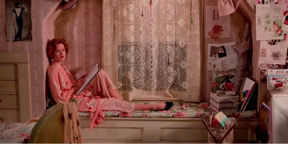
Andie Walsh’s bedroom in Pretty in Pink
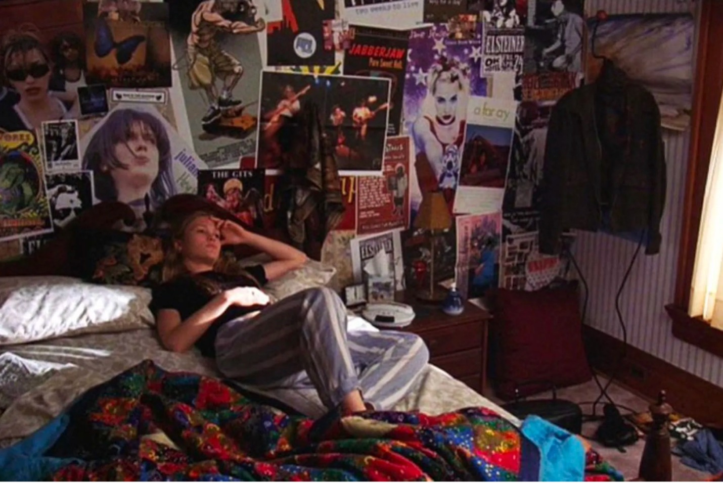
Kat Stratford’s bedroom in 10 Things I Hate about You
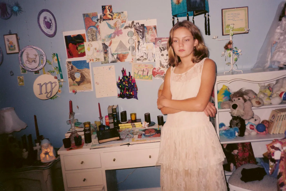
Lisbon sisters’ bedroom in Virgin Suicides
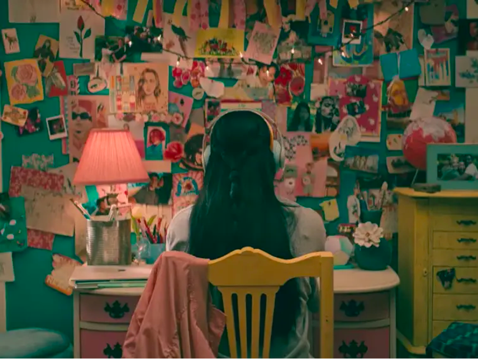
Lara Jean Covey’s bedroom in To All the Boys 3: Always and Forever
It is unsurprising that many young girls, on screen and off, live through their tween to teen stages of life surrounded by a swirl of paper taped to their walls. Collage aesthetics are inextricably tied to girlishness and the embracing of an unfixed self. I use “girlishess” here to refer not to an explicit or exclusive gender category, but instead a quality of being that emphasizes youth and femininity—the energy that exudes from the film stills included here. During this period of life, older people always seemcut to be asking, “what do you want to do?” Against the mounting pressure for girls approaching “adulthood” to funnel their interests into a singular, legible narrative, collage allows for messiness and intentional ill definition. Collage offers respite from the expectation of absolutes, and it can continue to do so beyond our youth—as an exercise, it acknowledges the self not as a fixed concept, but instead as a handmade, ever-evolving project.
The structure of this essay embraces this ideology, considering collage as generative process not only for images, but also for text.[1] Here, I consider the concept of “cut and paste” in contemporary culture through various processes of identity formation. Waving goodbye to the girls in the films referenced above, I next move to the materials that they employ–the magazines themselves. A series of magazine issues published in the early 2000s provides a lens that clearly links their design language at this time to the world built by the anonymous French collective Tiqqun in their text Preliminary Materials Toward the Theory of the Young-Girl, first published in 1999. This timeframe also ties to my own subjectivity, as I grew up reading these magazines in the aughts. Shifting mediums, I next reach to theories of gender presentation put forth by Catherine Driscoll and Heather Warren-Crow and look at how they appear in pop music. Finally, examples of collage in contemporary art serve as this essay’s last layer. My chosen set of visual artists that I reference, whose work embodies a “girlish” aesthetic sensibility, employ the “amateur” method of collage with care and powerful intention. Though presented in a linear fashion, my wish is for the reader to approach the wide-ranging variety of material included in this piece as modular. I imagine the sections of this text as “bi-directional” links, designed to reveal further connections if theoretically shuffled. Kind of like how you read a magazine.
Teen Magazines! All Access! Read This Now!
Before the internet ruled our process of culture consumption, magazines delivered a concentration of aspirational imagery to people anywhere in the world. The glitz and glamor of big city photoshoots dutifully arrived monthly in mailboxes as a fresh set of perfect-bound, glossy pages. Magazines promised to offer their readers guidance toward becoming their best selves. Teen magazines marketed toward girls in particular provided advice designed to assuage an anxious teenager as she encountered many of life’s “firsts” relating to makeup, fashion, fitness, and sex. Their eye-catching, glimmering covers are intended to make a young girl’s heart pound with desire. To understand the mechanics at play in these magazines’ defining visual language, we must zoom in.
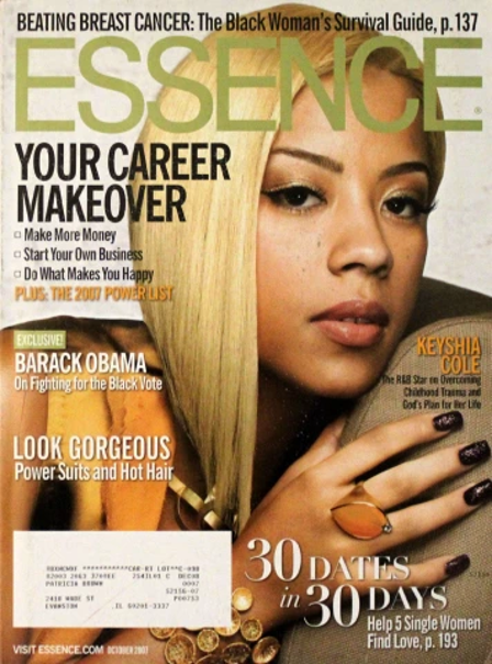
Magazines such as Tiger Beat, Seventeen, and Rookie, though marketed toward different demographics within the tween/teen girl universe, share a strong attachment to collage as a guiding visual strategy. Consider the classic Tiger Beat cover. On each one, Tiger Beat’s logo lies in the upper left corner, anchoring the layout. The title “Tiger” itself showcases a collage of capitalization: every letter is uppercase but the ‘i,’ which is lowercase and dotted with an illustrated heart. “Beat” is all lowercase except for the final ‘T.’ Despite these unusual typographic variations, the logo remains one of the most stoic elements on the page.
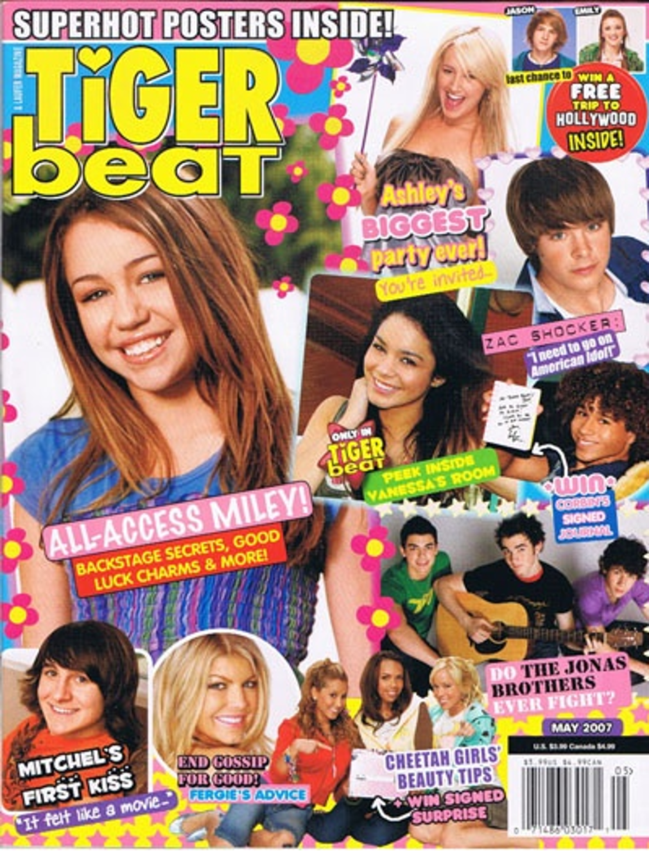
Tiger Beat magazine cover, May 2007
Photos of the biggest teen stars of the times are sprinkled across the cover, tilted at various angles and wrapped in various shapes. On the May 2007 cover, which epitomizes Tiger Beat’s early 2000s style, Miley Cyrus is featured most prominently. Hot pink and yellow flower “sticker” illustrations surround her image, both framing the photo and seeping within its borders. Vanessa Hudgens sits close by in a square image that boasts a bright white drop shadow. Then, the design deviates once again: Mitchell Musso and Fergie are enclosed by a solid white border, while Zac Efron peers out from a dark purple bordered portrait decorated with light pink little hearts. Unprecious about consistency, the assemblage of elements on this magazine cover celebrates multiplicity.
“ALL ACCESS MILEY! BACKSTAGE SECRETS, GOOD LUCK CHARMS, & MORE!” Rendered in bright pink, yellow, red, and white, the headlines on the cover of the May 2007 issue read as if they are shouting from the page. This is, in part, due to the liberal use of exclamation points. “SUPERHOT POSTERS INSIDE!” “Ashley’s BIGGEST party ever! You’re invited…” Allowing my eyes to bounce around the cover reminds me of being at the mall and walking through a sea of window displays intentionally designed to lure me inside.
A wide-range of typefaces give shape to the screaming text. Tiger Beat consistently showcases the largest variety of fonts I have ever witnessed on a single magazine’s cover design. On the May 2007 cover, I count at least thirteen. Font families, styles, and weights are mixed and matched. No two pieces of text are rendered with the same style guide. The colors are bright, saturating the text itself while also often providing short phrases with a solid backdrop. The phrases look like pieces of candy. These design choices make them feel extra feminine, frivolous, and adolescent.
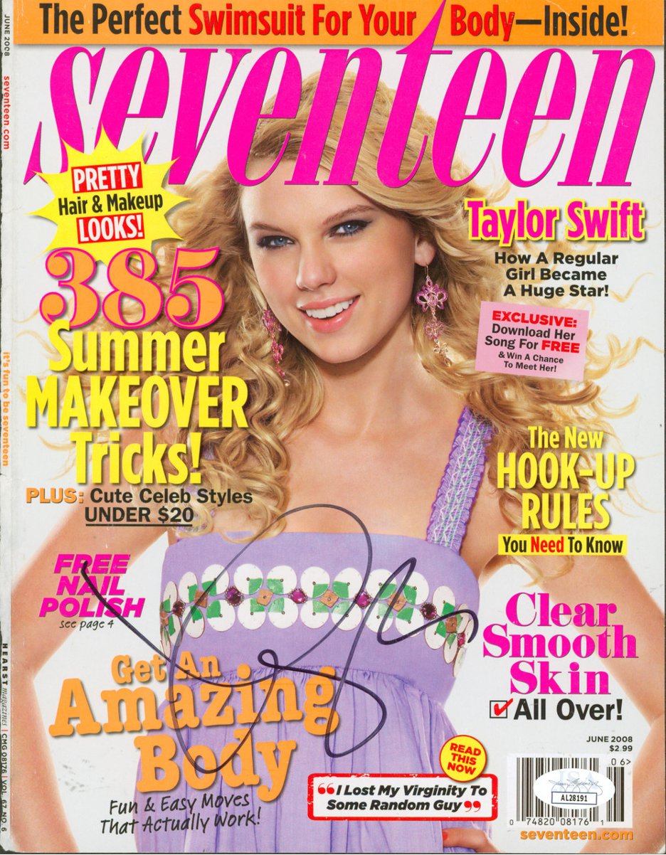
Seventeen magazine cover, June 2008
This is echoed in Seventeen’s magazine covers. Though each print cover generally features a sole image, the text surrounding the cover star is displayed in a wide variety of fonts, colors, and positions. On Taylor Swift’s 2008 cover, orange, puffy serif text toward the bottom entices, “Get An Amazing Body.” This text is emphasized with a dark drop shadow. “Amazing Body” appears to boast the largest font size on the cover save for the magazine’s title. These words sit directly to the left of a white box with a bright red border. The colors, a departure from the fun and flirty palette of the rest of the layout, communicate urgent warning: “I Lost My Virginity To Some Random Guy” black letters inside spell out. A yellow sticker-like element hovers over top: “READ THIS NOW,” it commands. These elements are meant to inspire different feelings, arguably aspiration and fear respectively. But by placing them next to each other, Seventeen begs for attention of all kinds. Any emotion you might desire, it promises to inspire.
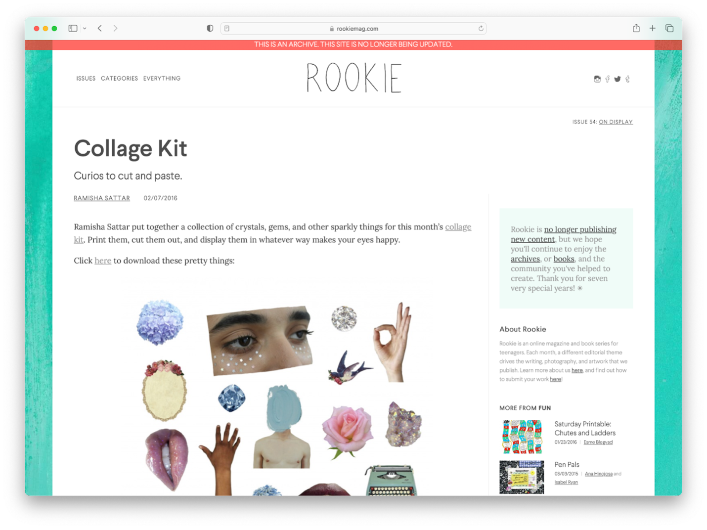
Rookie magazine “Collage Kit,” February 2016
This mass montage style, though produced with a softer aesthetic sensibility, also shows up clearly in the visual world of the iconic and influential magazine Rookie. Rookie, for the uninitiated, was an online magazine for teenagers created by style blogger Tavi Gevinson, a teenager herself at the time when the magazine first launched in 2011. Collage ruled the recognizable style of Rookie’s universe. Along with the publication of each monthly issue online, Rookie released a “Collage Kit.” The collage kit included both a sticker sheet style jpg intended for readers to print and cut out as well as a range of “background image” options. Readers were invited to submit their collages via email, and in the following month’s issue, Rookie published a series of select submissions to their website.
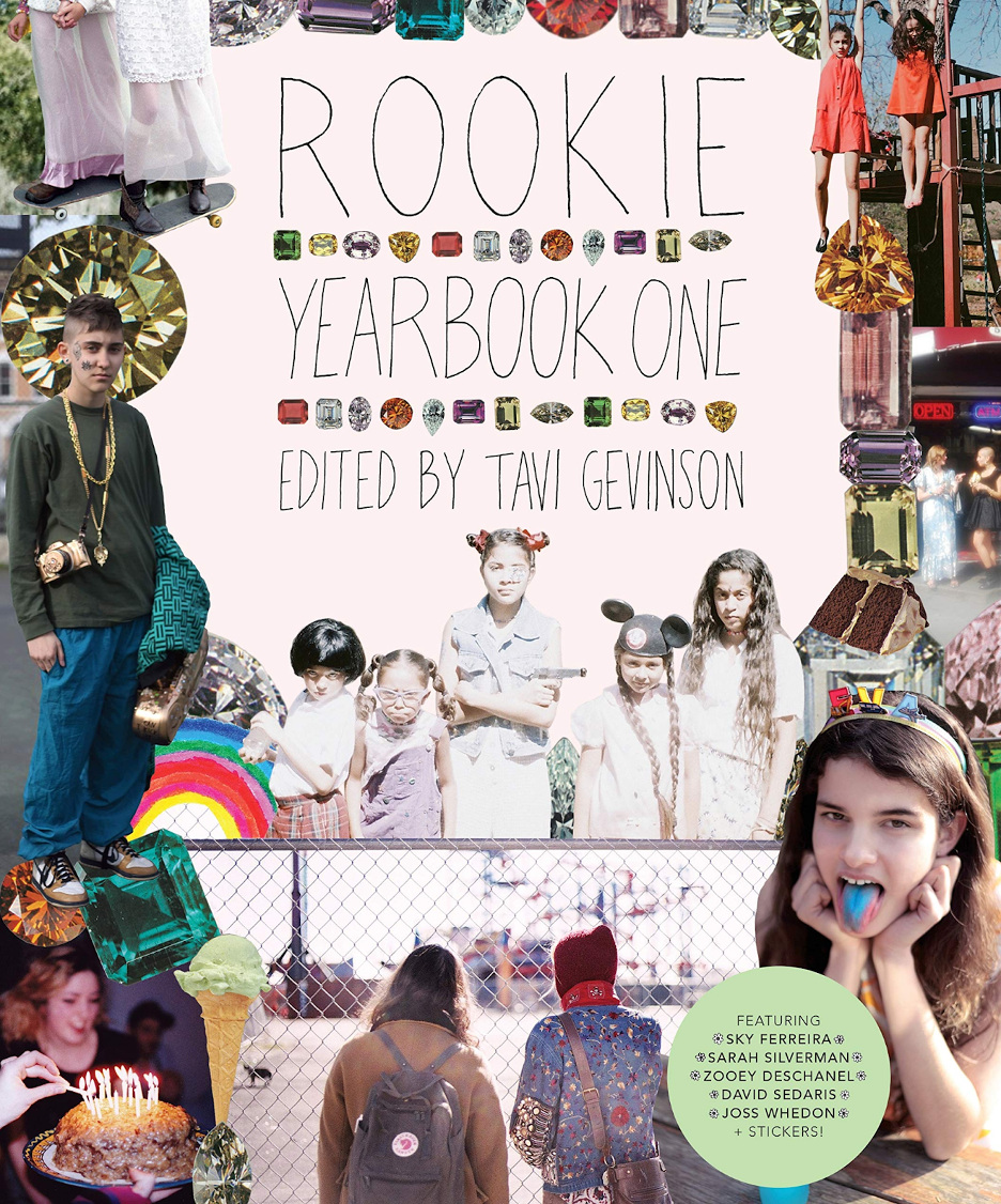
Rookie magazine, Yearbook One, 2012
Given this affinity for collage as a process, it is no surprise to see that Rookie’s very first print manifestation, Yearbook One, features a mega collage on the cover. Clearly disparate images overlap, framing the publication’s title. Two pairs of boots under flowy skirts ride a skateboard, an ice cream cone hovers on top of a chain link fence, a girl sticks out her stained blue tongue beneath a floating image of decadent-looking chocolate cake. Gem stones stack around the perimeter of the page, providing a decidedly non-digital style of sparkle that emphasizes the vintage-quality of the collaged photos.
All of these “teen magazine” covers, intentionally frenetic in nature, invite a “choose your own adventure” style reading. They are both themselves a collage as well as an invitation to collage to their readers. By presenting a multitude of entry points, they encourage their audience to pick and choose which elements they find most compelling and to follow that instinct inside of their magazine’s pages.
Tiqqun’s typography’s teen mag treatment
Intentionally, this “mix and match” style shows also up in a very different genre of publication. Tiqqun’s Preliminary Materials For a Theory of the Young-Girl, first published in French in 1999, offers a critique of the concept of the “Young-Girl” in relation to capitalism, consumption, and warfare. Its cutting and confrontational analysis has led to numerous derivative works. Recently, the text has risen in popularity due to the rush of essays covering the uptick in popularity of the concept of the Girl, specifically online and in fashion. While most of these essays clearly dissect the content of Tiqqun’s text, I surprisingly see less discussion of its unique formal presentation.
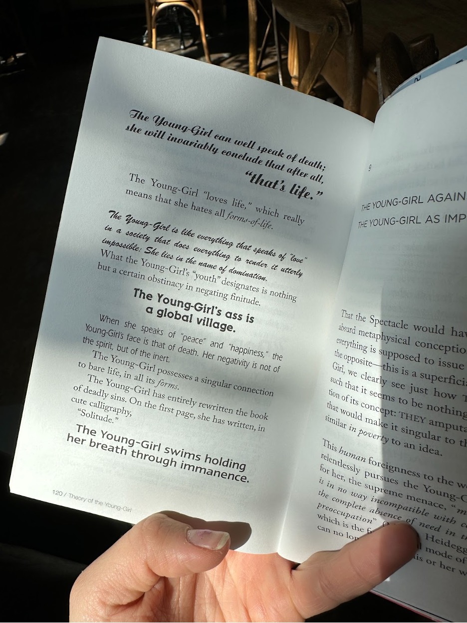
Page 120 of Tiqqun’s Preliminary Materials For a Theory of the Young-Girl
On every page, each sentence varies in visual style and scale. The resulting effect parallels the experience of perusing the cover of Tiger Beat. It feels as if each sentence is beamed into your mind in a different tone of voice. Curly fonts sound disarmingly sweet, while bold, impact-style fonts sound bold and berating. A range of emotions, smashed together through simple stylistic manipulation. In her 2013 essay “The mystique of the young girl,” Catherine Driscoll does point this out, referencing its “collage style, piecing together various ‘clippings’ with aphoristic assertions and component text-blocks in ways that resembled the formal layout of girls’ magazines.”[2] The reuse of this recognizable “teen magazine” style to present a critical text feels heavily uncanny. On page twenty-four of Preliminary Materials, in a showcase of bouncing type-alignment, sentences are aligned to the left, right, and back again. At the bottom of this page, Tiqqun proclaims, “The Young-Girl never creates anything; All in all, she only recreates herself.”[3] This phrase emphasizes the irony in their use of collage aesthetics. The Young-Girl, in their eyes, lacks the ability to produce. Instead she can only appropriate, “recreate” rather than simply “create.” By employing a variety of typefaces, the book as a whole reads not only like a magazine, but also like a ransom note, especially given its anonymous authors. Stolen letters and ideas are placed together like patchwork on a page. Tiqqun holds the Young-Girl hostage with their words.
Later in the text, Tiqqun directly references the form they are mimicking: “Just like the magazines THEY intend for her and which she devours so painfully, the life of the Young-Girl is divided and organized into so many columns, between which the greatest separation reigns.”[4] This statement directly refers to the Young-Girl’s self as siloed, pointing out how she separates her life into a series of discrete vectors, just like sections of a magazine: Fashion, Beauty, Love, Life.
Though Tiqqun’s tone throughout comes across as damning, I would like to offer a more generous reading of this idea of internal self-separation. It is useful to take a cue from the template for the Young-Girl offered here and adopt a more Goffmanesque concept of self. One that acknowledges the self “as a performed character” rather than an “organic thing that has a specific location.”[5] His dramaturgical theory offers a foundation for understanding how our concept of the self might evolve to be “responsive,” like a website that adjusts to the size of its screen. Goffman proposed this sociological theory on the presentation of self in the late 50s, but today, we operate in a world of “locationless-ness” with unprecedented physical unspecificity. Collage relies on the discovery of found materials, and in the age of the internet, we are gathering material at a rate faster than ever.
In their publication Young-Girls in Echoland, written in response to Tiqqun’s text with the intention of critiquing its declarations in the digital age, Heather Warren-Crow and Andrea Jonsson comment on this suggestion of multiplicity in relation to digital space. They write, “The sheer number of definitions that Tiqqun provides gives us, as readers, the feeling that she is everything and nothing, as apparently boundless as cyberspace, where much of the theory of the Young-Girl so effectively circulates.”[6] Joanna Walsh echoes this in her book Girl Online: “I am shown the self-similar, similar to the self the algorithms I enter record, until I am like what I like onscreen. On Tumblr, Instagram, Pinterest, I am making a self through photographs of things that self would like to have.”[7] Definitively, these theoretical texts all assert that this process of making sense of oneself within a sea of image montage possesses a girlish quality.
‘Cause I’m just a girl, oh, little old me
Girl, girl, girl! Why does all of this discussion center on the idea of “girl” and not “woman?” In her seminal text “Girls: Feminine Adolescence in Popular Culture and Cultural Theory,” Catherine Driscoll defines girlhood as “an idea of mobility preceding the fixity of womanhood and implying an unfinished process of personal development.”[8] Warren-Crow doubles down on this in her book Girlhood and the Plastic Image. She writes that the contemporary aesthetic subject is “a creature of variable scale and format modeled after the morphing, mobile, and girlish digital image.”[9] Emphasizing “girlishness” not as a discrete gender category, but rather as an unfixed, amorphous state, Warren-Crow’s argument encapsulates the desirability to claim “girlish” qualities when working to make sense of oneself in the digital age. Girlishness’s inextricability from the aesthetics of collage begins to feel like a relief when we are working through a hyper-pace of consumption. “I’m just a girl,” girls claim online. Gwen Stefani claims this in No Doubt’s song “Just a Girl.” Olivia Rodrigo claims this on her GUTS tour tank top. The pronouncement reads like a wink in its desire to acknowledge both the frustrations that come with embracing this identifier while also capitalizing on its commercial viability. Like the collages on the cover of Tiger Beat, it softens its aggression with a dose of saccharine sweetness. “I’m literally just a girl online” says this TikTok audio, after acknowledging theoretical “cult leader” accusations. The static quality of “woman,” as visualized throughout popular culture, frightens. “Girl,” on the other hand, with its embrace of assemblage, frees.
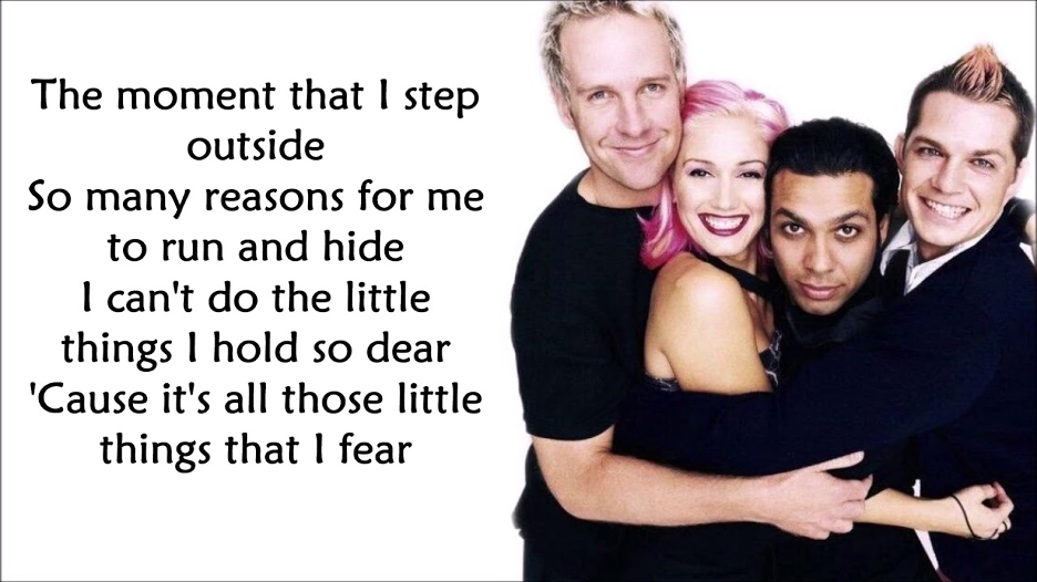
“Just a Girl,” No Doubt Lyric Video

Olivia Rodrigo wears a tank top that says “JUST A GIRL” while performing onstage. Image via USA Today.
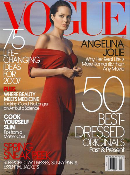
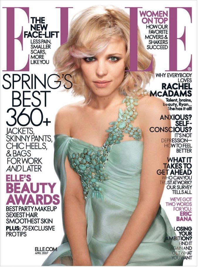
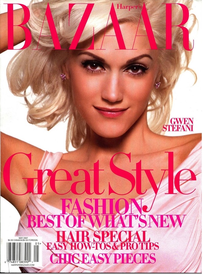
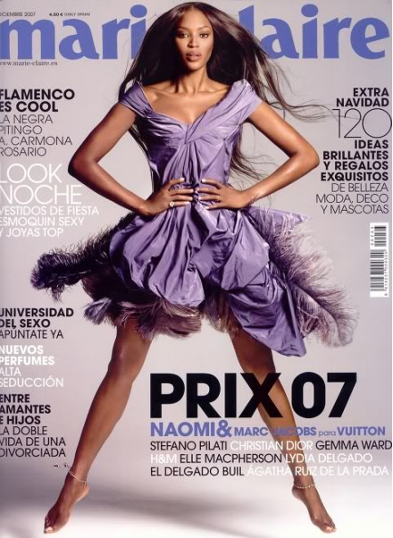
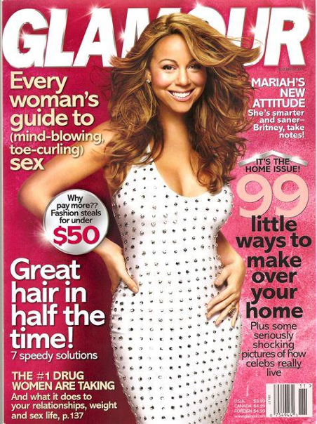
Let’s return, for a moment, to print as a medium. Charting the cover design of magazines marketed toward women in their post-teenage years, we see a decline in chaos across image and text. Looking specifically at issues from 2007 as we did with Tiger Beat, we see that Vogue, for example, features a single image and only two or three colors of text. Their instantly recognizable logo, rendered in large, all uppercase serif font, sits in stark contrast above the sleek sans-serif headlines below. A similar formula is used by Elle, Harper’s Bazaar, Marie Claire, Glamour, more. One woman, one looming logo, and one, two, or three sleek stylings of text.
Somewhere in between the evolution of “girl” into “woman,” collage aesthetics in the media market give way to structure and simplicity. More “mature” representations of woman emphasize elegance and decisiveness, implying one’s identity should, by a certain point in life, graduate from flailing flexibility into a fixed-state form. But can carrying with ourselves an affinity toward collage aesthetics become a valuable method for producing our present self-concept at any age? Crucially, collage relies on appropriation. As a practice, it involves extracting elements from a variety of sources in order to produce an outcome that proves greater than the sum of its parts. Similarly, as individuals, we rely on external influence in order to construct a sense of self.
Good artists borrow, great artists steal
The word “collage” derives from the French verb “coller,” meaning “to glue” or “to stick.” Many attribute the term’s coinage to Pablo Picasso and Georges Braque, who gained notoriety for creating works composed from a variety of materials including fabric, paper, and newsprint. More recently, a cohort of contemporary artists have turned to the teen magazine, as well as its more modern digital counterpart, social media, as material for collage. Their work reflects the insistence of Warren-Crow on the on the girlish plasticity of both the digital image and the internet-entangled self.
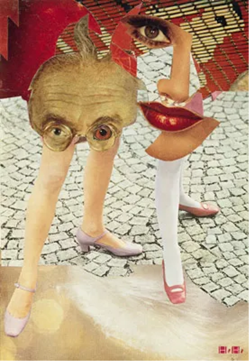
Hannah Höch, Grotesk, 1963, photomontage, 9 7⁄8 x 6 5⁄8″.
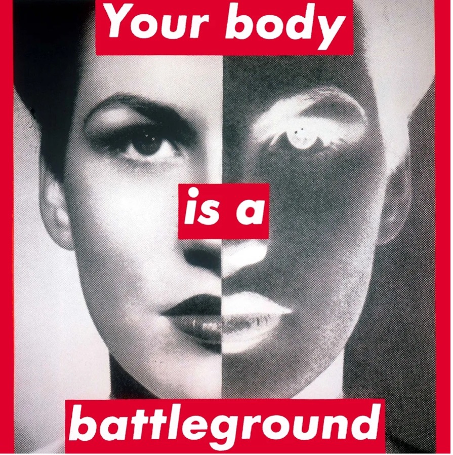
Barbara Kruger, Untitled (Your Body is a Battleground), 1989.
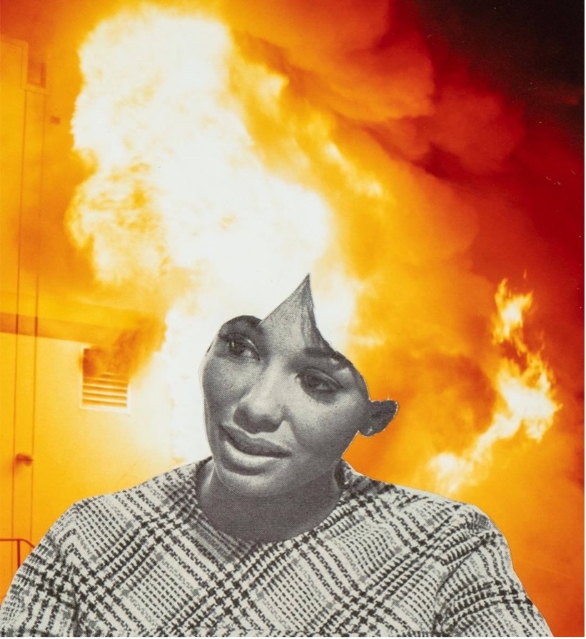
Lorna Simpson, Flames, 2019 (detail).
For decades, feminist artists have turned to teen and women’s magazines as inspiration in their practice. This is evident in the work of collage pioneer Hannah Höch, who worked within the male-dominated Dada movement while making work criticizing the politics of and propaganda around gender equality in Germany. This tradition has been carried on by Barbara Kruger and Lorna Simpson, both artists who gained attention for their use of collage in relation to the female body. Kruger mimicked a magazine’s bold, editorial visual style in her combinations of text and imagery. Most famously, her work “Your body is a battleground” renders its message as a series of separate cut up “pieces” that appear to be snipped from the same red sheet of paper. Simpson also focuses on the female body, looking specifically at the Black body and beauty standards. She often positions women’s hair as her center of attention. In her work Flames (2019), a woman’s image from a wig advertisement is snipped out and surrounded by fire rushing out of a burning building. The bright orange flames replace her hair in the image and surround her silhouette. With this intentional pairing of just two disparate source images, Simpson conveys extreme emotion through her creation of absurdity. The woman’s calm expression looks out of place against the wildfire surroundings. Before making this work, both of these images already existed. The art happens in Simpson’s practice of weaving them together.
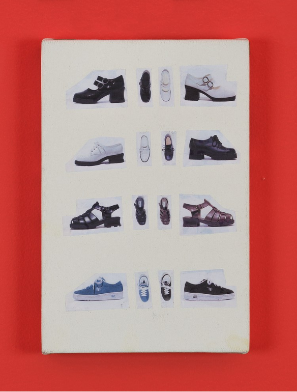
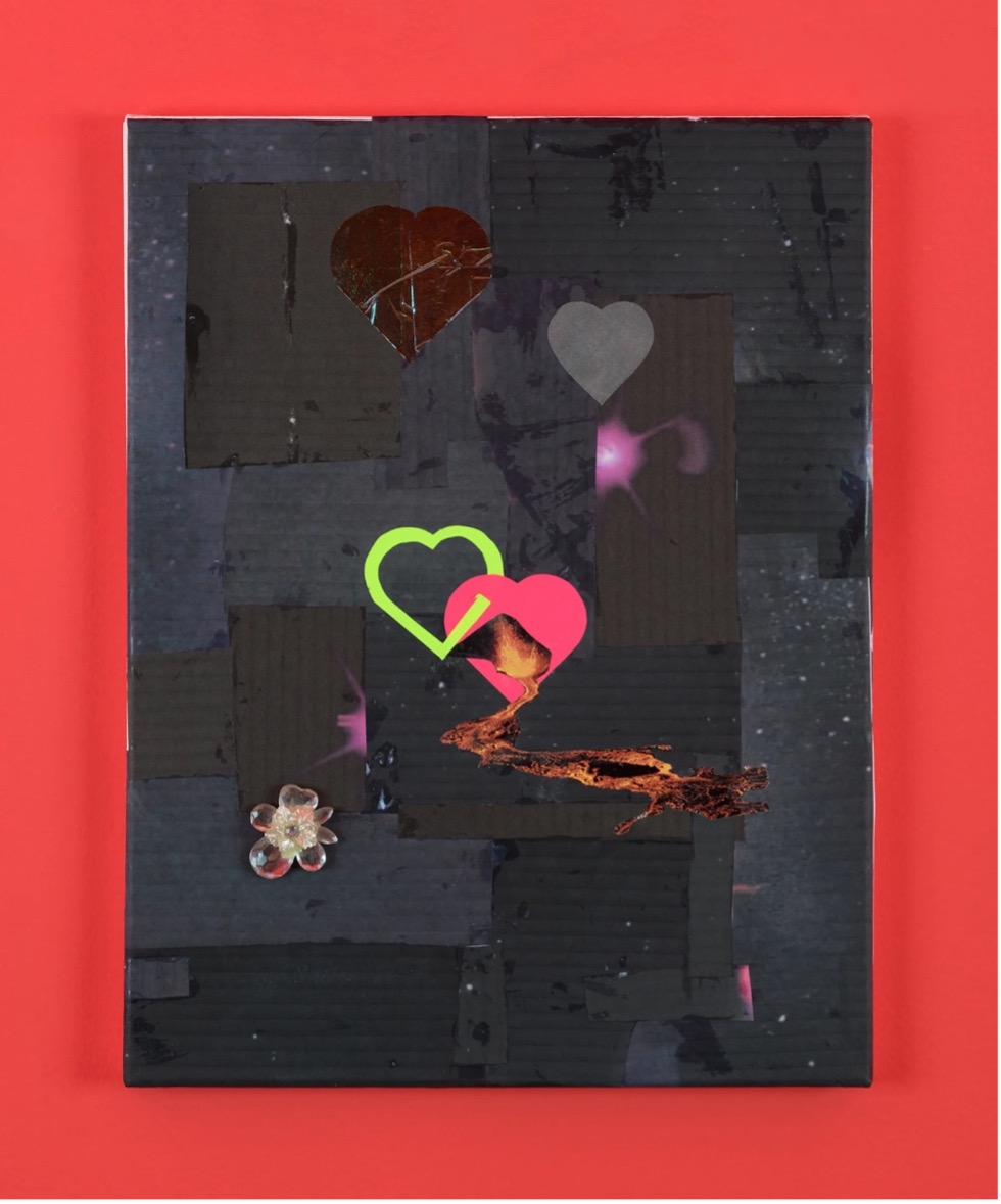
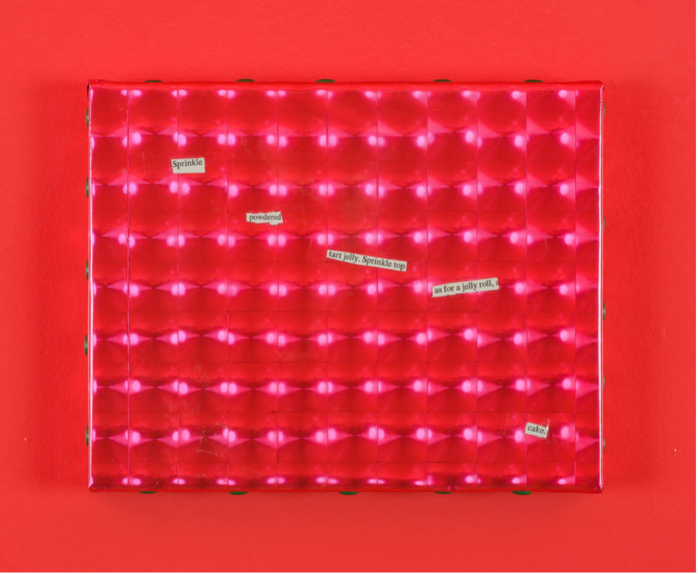
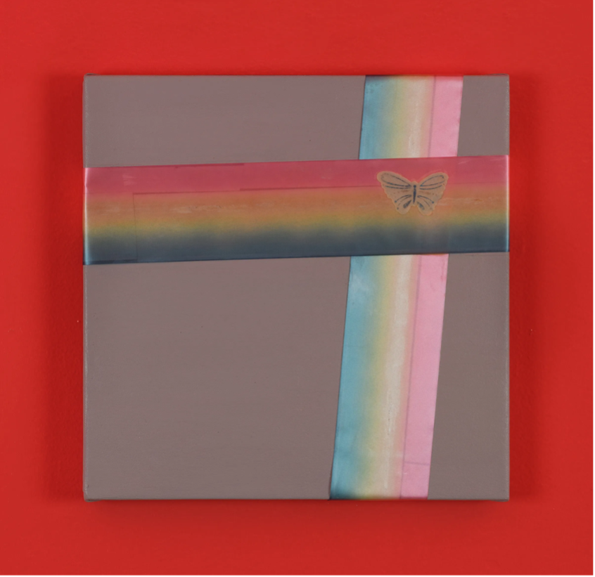
All works by Maggie Lee, Vintage Paintings at Jenny’s, 2021.
In the work of artist Maggie Lee, collage becomes a method of expressing a hyper, girlish energy on canvas. Her “vintage paintings” often incorporate clippings from magazines placed in an ad hoc layout that appears deceptively casual, yet upon closer inspection I see that each composition is impressively controlled. Exuding both a punk sensibility and the sparkly spirit of a Delia’s catalog, Lee’s work challenges the sterile, whitewall gallery space. She offers a commitment to girl culture and DIY processes of making that defy uniformity.
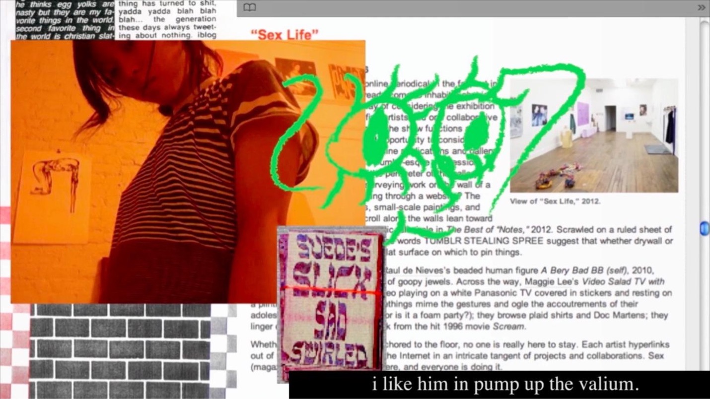
Still from Maggie Lee’s Mommy, 2012–2015
This attitude also shows up in her feature documentary film Mommy (2015) which heavily employs collage aesthetics as a method of visual storytelling. Often layering images, video, gifs, and illustrations on screen all at once, formally, the film feels like a digital incarnation of Lee’s wall piece works. Throughout the film, Lee collages together the story of her life. Pieces of her past and present are pulled together in a single scene. Light moments of partying are juxtaposed with deep moments of pain. The film’s collaged style reveals a difficult truth of grief. It can break into pieces and blend amongst everything else, taping over one’s current life, obstructing and reframing it, to morph it into something completely new.
Molly Soda, Chick Magnet, 2023
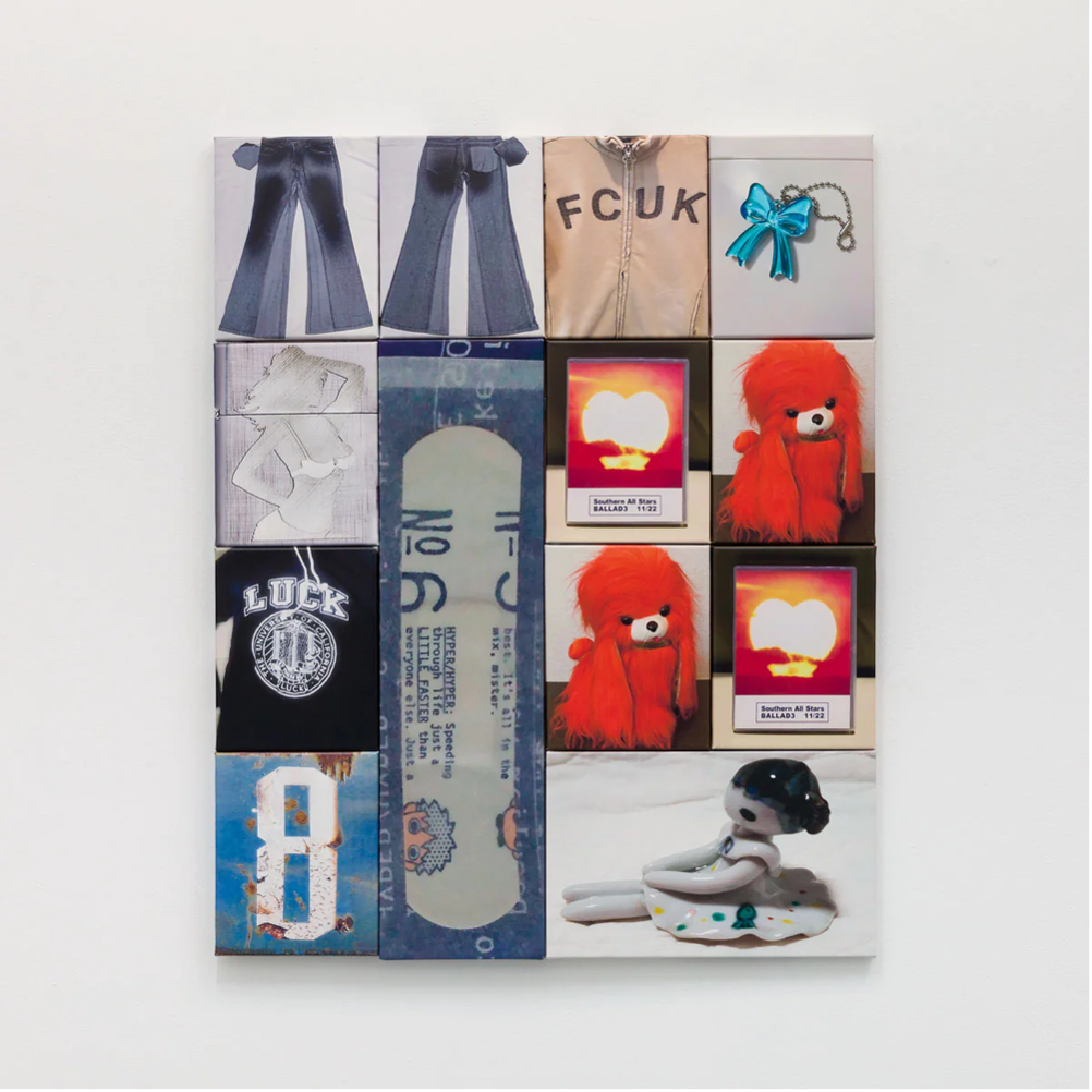
Sara Yukiko, Luck / Fcuk, Ink on Canvas, 24 × 40 in, 2022.
Today, with the computer as a ubiquitous tool for creation, we no longer require glue or physical foraging to combine elements on a single plane. Many contemporary artists working with the process of collage now spend time gathering, collecting, and organizing images found on the internet. Artists Sara Yukiko and Molly Soda both engage in this extensively. Yukiko demonstrates an explicit attention to detail and juxtaposition when composing her pieces, which are primarily made up of imagery found while browsing peer to peer online shopping platforms such as Ebay. In her piece, LUCK FCUK, she plays with rhythm, rhyme, and symbolism. One t-shirt depicted clearly reads “LUCK.” A zip up sweatshirt at the top reads “FCUK,” which, despite the mixed up letters, lodges in my mind as a perfect rhyme. Emphasizing the digital nature of the original images, she prints the same image multiple times. Two red dogs and two sunset hearts. Arranged together in a collage of printed canvases, the final work invites its audience to marvel at this careful combination of imagery. Look at all of these objects: there is a sweetness in seeing these disparate, inanimate things suddenly introduced to the worlds of one other. Highlighting the collage’s presence as a gentle gift, the work is topped with a clear, turquoise keychain bow.
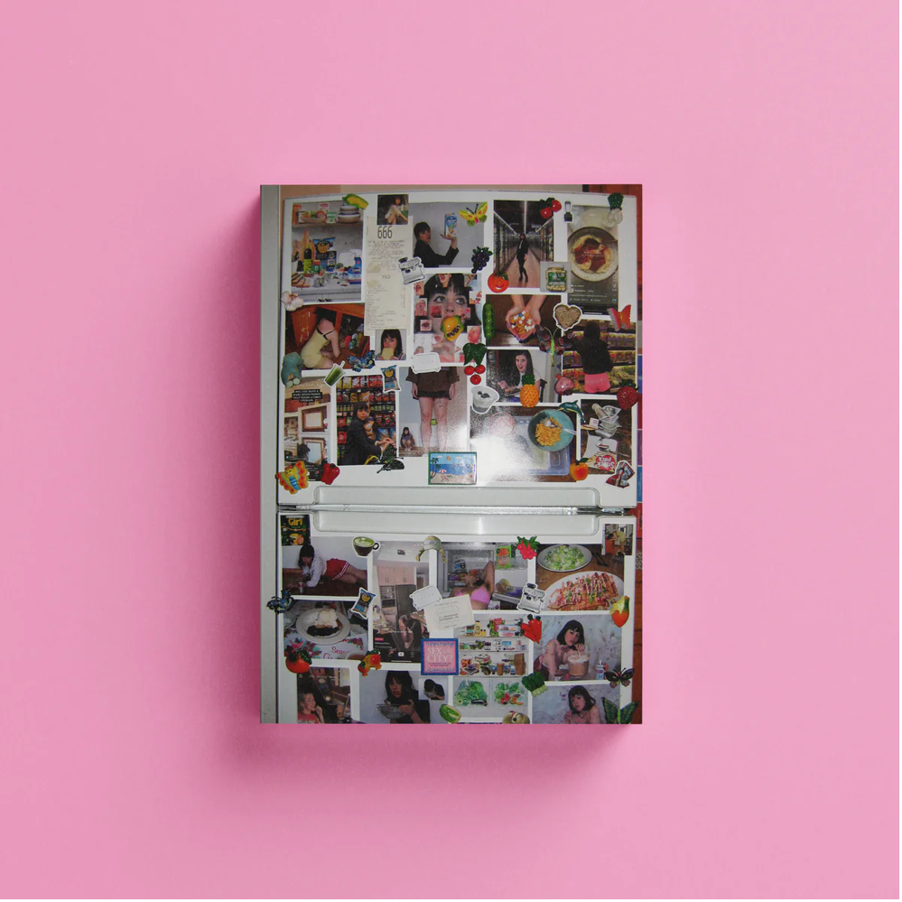
Internet images become messier and magnetic in Molly Soda’s publication Chick Magnet (2023). Focusing on the fridge as a foundation for a food-centric “vision board.” Images of Soda interacting with a variety of dishes and drinks clutter her fridge door, held up by a combination of custom, kitschy magnets. This unceremonious style of image-presentation becomes profound in the way it allows the pictures to perform. Soda plus Almond Breeze, Soda plus the frozen aisle, Soda plus a pair of pink short shorts that spell out AESTHETIC in rhinestone letters on the back. Seeing her participate in these mundane activities through this series of imagery feels unnervingly intimate. It is both casual and dramatic. Casual, because these activities are ones we all partake in every day. Dramatic because Soda is consciously publishing the documentation of her performing these activities. There is a self awareness to this collage that underscores the experience of being online, scrolling through thousands of images intended for presentation in the context-collapsed social media universe.
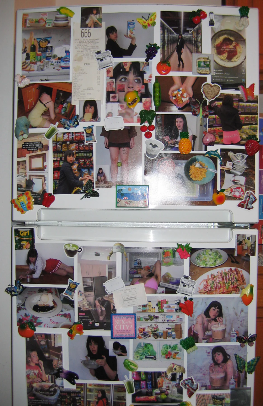
Molly Soda, Chick Magnet, 2023
Through their unique cut and paste methodology, all of these artists’ work embodies the spirit of the teen magazine while reckoning with the process of making sense of the self. I find comfort in researching their practice and their process for this reason. A collage-approach to self-presentation allows one to cherrypick what in the world most closely aligns with their desired identity at any given moment and adopt that thing as their own. Essentially, cutting it from its original context and pasting it onto the meta “vision board” that one maintains in their mind to encapsulate what constitutes themselves. In her blog post on vision boards, Molly Soda writes, “Vision boards feel like a furthering of this feminine drive. They are the Girl Boss older sister to the tweenage notebook stuffed with magazine clippings.”[10] Vision boards, by way of collage, allow you, the vision boarder, to claim control while maintaining an openness to change. Is that not the most reassuring way to imagine constructing identity itself?
For decades, from the birth of Tiger Beat in 1965 to the millions of girls’ scrollable pinterest boards overflowing with images today, collage aesthetics have guided youth culture. The aesthetic’s allowance for metamorphosis and multiplicity shepherds endless cohorts of teens into adulthood, freeing them, for a period of time, from the oppressive imposition to present one True Self. It is possible, that beyond our teen years, collage aesthetics can continue to provide a valuable framework for self-actualization. Tiger Beat’s chaotic, collaged energy lives on in the moments we allow our self-concepts to shift and evolve. Tiqqun writes, “The ‘self’ of the Young-Girl is as thick as a magazine.”[11] Whose self can dare to declare itself any thicker? Cut up everything about yourself that you believe to be true and rearrange the pieces on your bedroom wall. Now take a step back. You might be surprised to discover that identity is constructed not with hammer and nails, but instead with found ephemera, cheap glue sticks, and scotch tape.
[1] This idea is explored by Terry Nguyen in her syllabus “On the Wor(l)d as Collage, or Intertextuality”
[2] Driscoll, Catherine. “The mystique of the young girl,” Feminist Theory 14 no. 3 (November 2013)
[3] Tiqqun. Preliminary Materials Toward the Theory of the Young-Girl (Los Angeles: Semiotext(e), 2012), 24.
[4] Tiqqun, Preliminary Materials Toward the Theory of the Young-Girl, 30.
[5] Goffman, Erving. The Presentation of Self in Everyday Life (New York: Anchor, 1959)
[6] Warren-Crow, Heather and Andrea Johnson. Young-Girls in Echoland (Minneapolis: University of Minnesota Press, 2012)
[7] Walsh, Joanna. Girl Online: A User Manual (New York: Verso Books, 2022)
[8] Driscoll, Catherine. Girls: Feminine Adolescence in Popular Culture and Cultural Theory (New York: Columbia University Press, 2002)
[9] Warren-Crow, Heather. Girlhood and the Plastic Image (Darby: Dartmouth College Press, 2014)
[10] Soda, Molly. “Chick Magnet.” (¯`*•.¸,¤°´✿.。.:* 𝐈‘м ᶤℕ 𝐥𝐨𝓥ᗴ ŴιTʰ 𝕄𝕐 𝓹𝓸𝐫т@𝐥 *.:。.✿`°¤,¸.•*´¯) August 25, 2023. Accessed April 03, 2024. https://mollysoda.substack.com/p/chick-magnet
[11] Tiqqun, Preliminary Materials Toward the Theory of the Young-Girl, 43.

Dilettante Mail
Get updates from us a few times a year.